Row Properties for Admins
Written By Danny Schaffer
Row Properties will allow you to customize things like the background color, background image, etc., within a row.
To edit a row's properties, click on the area to the left or right around a row that has been added to your template or marketing piece:
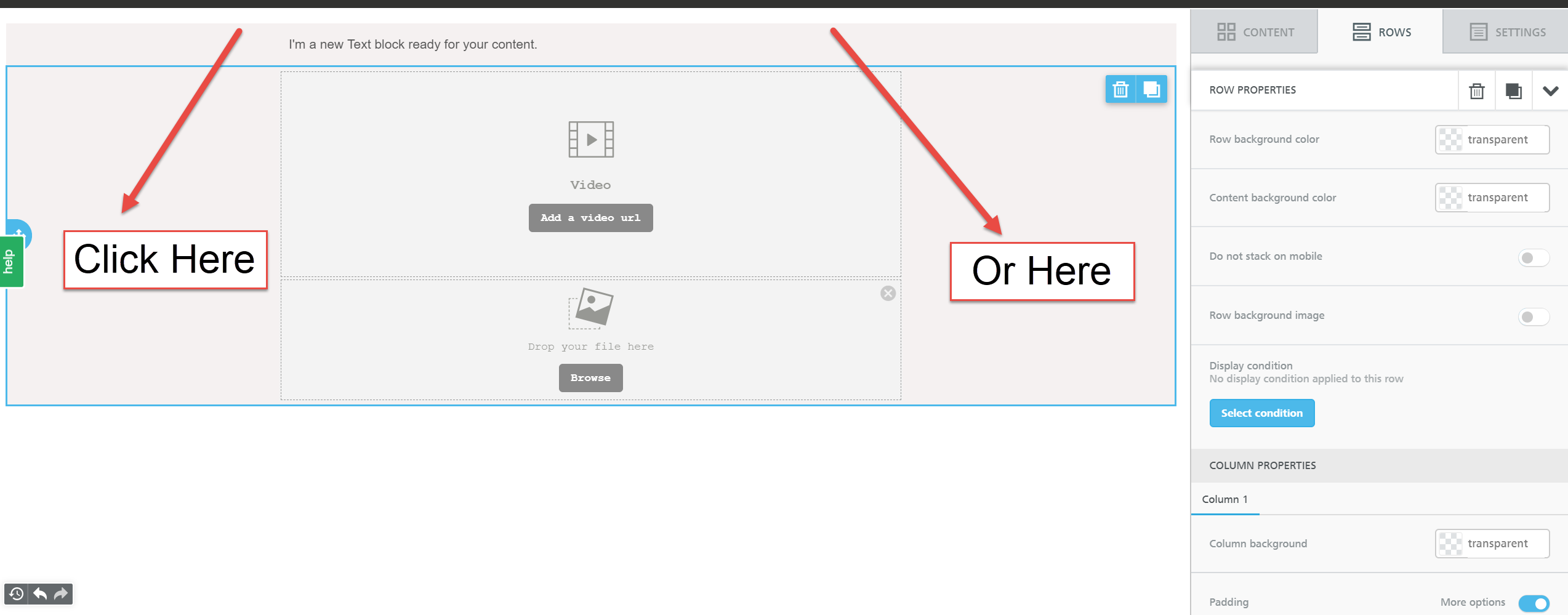
Once you have selected your 'row', you will find ROW PROPERTIES appear along the right:
Backgrounds & Borders
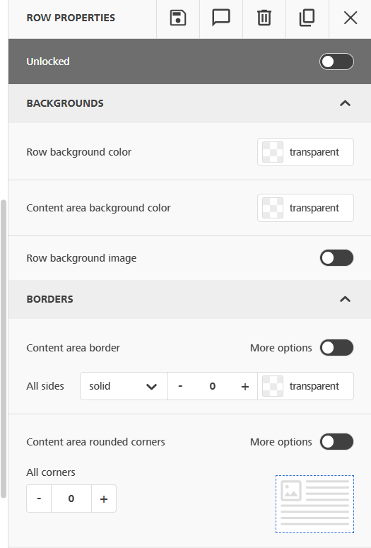
Unlocked/Locked: This will allow you to lock down content for your agents. If the lock is enabled, agents will not be able to edit this content. If left unlocked, agents will be able to edit the row to add their own content.
Row background color: This will allow you to adjust the background color of the full row, stretching to the widths of the row.
Content background color: This will allow you to adjust the background color restricted to the content area. To help visualize this better, please feel free to apply a different color to the row and content to see each area that will be affected.
Row background image: This will allow you to add an image that will serve as the background of the row. Please keep in mind that background images do not have full support across all email clients, so it can be beneficial to add a background color to the row that is similar to the image you are using here.
Content Area Border: Apply a border to the outside of the entire row itself, or expand out to give more options to apply specific borders (any combo of left, right, top, bottom to different thicknesses or colors).
Content Area Rounded Corners: You can even round the corners of said border to add a design accent. Curve individual border edges by toggling “more options”
Layout
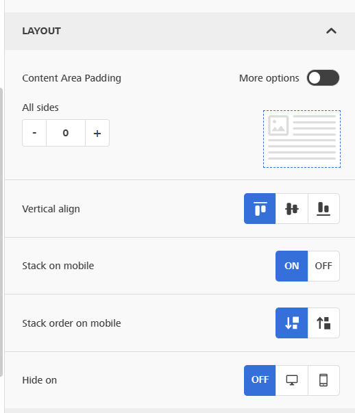
Content Area Padding (Layout): Adjust specific content area padding for the entire design within the borders. Control all padding in one setting or toggle the “More options” area for finer control over each side.
Vertical Align: Align all of the content across the row with either the top, middle of the content (middle of the content of the longest column), or bottom (bottom of the longest column).
Stack on Mobile: This allows you to set the content to remain in columns on a mobile device. Use this setting cautiously as on a mobile device, this may make the area quite small. Avoid using this for anything that scales height based on the words included (as this could make an area really tall).
Stack order on mobile: The default stacking will go from from columns to the left to columns on the right.
Take the above example. “Default” would display the column vertically showing the areas in a single column as A1, A2, A3, B1, B2, B3. “Reverse” would show B1, B2, B3, A1, A2, A3.
Hide On: This lets you hide the entire row and it’s content on either Desktop or Mobile view. Be sure to check the Preview to see how content is set to display on Desktop and Mobile devices in the end.
Cards
Cards specifically consider each column in the row a unique area. You can apply styles to those cards and between them.
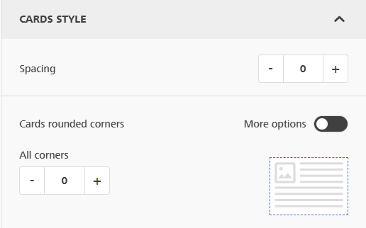
Spacing: Adjust the spacing around the outside of the cards (columns in the rows) themselves
Cards rounded corners: You can round corners of the cards for use with the borders available for each column.
Columns Structure
Create and control individual rows, weighing them against each other to make some different ratios.
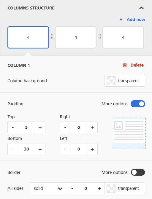
Columns: You can click + Add New to create a new column on the right side of the row.
In the column interface, you can drag the 8 dots between the columns to adjust the ratios between the columns. There are a total of 12 units of space available, so 1, 2, 3, and 4 column rows can have even distribution. 5 column rows can’t be evenly used, though that would make content quite small.
Column Specific Settings: View the column selected in the blue outline to change the settings below for it specifically. Any changes you want to make in each would need to be made in all columns separately.
Padding (Columns): Adjust the padding overall or on individual sides using “More options”
Border (Columns): Give individual columns their own border. This pairs with the Card Rounding Corners above to create rounded borders to columns.